Route 44 – A Journey, Chapters 17 & 18

Chapter 17
I started teaching again during the 1991 academic year. That same year the University changed its name to the University of Central Oklahoma. The one area that I felt was my weakness was in computer graphics so, as soon as I learned that I got the teaching position I contacted a friend/designer that I knew was on the forefront of computer technology and he advised me on my first Macintosh computer purchase. I remember vividly he said I would need the computer, of course, a scanner, a color monitor, an external storage system and a printer. The total package came to $12,000.00. A lot of money but in those days an entry-level typesetter cost about $50,000.00 so, this seemed like a bargain. The learning curve was steep for me. I was a person that shied away from technology and really enjoyed the old school methods. I didn’t even know how to type, and still don’t, which is painfully obvious as I hunt and peck my way through this book. My friend helped me hook everything up and showed me how to turn it on, but after that I was on my on. I enrolled in a local computer software class on PageMaker, which helped get me over the initial hump. Luckily, in my first semester I was scheduled to teach all traditional art classes, mostly beginning drawing. Once again, someone was looking out for me. This gave me a semester to get better on the computer. I realized after I was at school that they had two computer graphics classes, one was called Desktop Publishing and featured PageMaker and the other was called Computer Graphics and featured the drawing programs called FreeHand and Illustrator. I had acquired enough knowledge about PageMaker to make me dangerous, but I knew nothing about Freehand or Illustrator. At that time a company called Aldus distributed PageMaker and FreeHand. Illustrator was Adobe’s flagship software. I was scheduled to teach Computer Graphics in the spring semester, so I had a lot of work to do to get ready. I had always heard the old saying “If you want to really learn a subject teach it.” I found this to be true my first year teaching in North Carolina when I had to teach an Art History survey class. I was not particularly interested in art history as a student but when I taught it took on much more meaning for me and I learned far more than I had previously in all my Art History classes as a student. It proved true again in Computer Graphics. By the time the semester was over I felt very comfortable with the computer.
Being back in a University setting was really good for my painting. I now had more time to devote to it and a purpose with a few shows like the annual faculty show, as well as the “Painted Photograph” show that Bill Wallo had originally asked me to participate in. I was also teaching at Oklahoma City University as an adjunct. At OCU I taught more fine art courses including painting. At UCO, my full-time position, I taught graphic design classes. About two or three years into my new teaching duties, I felt completely comfortable with the Mac computer and its uses in the graphic design industry. At UCO, I took over the responsibility of trying to stay on top of the constantly changing world of technology. One of the areas we needed to improve was our printing capability. Advancements had been made to desktop printers and now there were color laser and inkjet printers that allowed the designer to produce pre-print comps that were comparable to finished offset prints. These printers allowed the designer to preview what the design would look like after printing. I saw a great need for this type of printer in the classroom. Graphic Design students rarely had the opportunity to see their projects printed and this fact definitely limited their abilities to produce visually exciting portfolios. I started trying to get one of these printers for our program and at the end of our budget year, the chair of the department, Dr. Hummel, told me that we had enough left in our budget to purchase one but that I had to get the estimate and purchase order complete and submitted that day. I started scrambling and called our local Xerox distributor and got an estimate. I quickly asked our secretary if she would type up the purchase order. I then walked it across campus and got the necessary signatures to complete the order. The model I chose was a Tektronix solid inkjet printer that was capable of printing on almost any paper in full color up to a tabloid (11”x17”) plus bleed making the largest paper size 12”x18”. For that time it was the perfect comp printer. It was a major purchase for us and cost over $9,000.00. It proved to be one of the most valuable purchases we ever made for our Design program. It immediately impacted the students and their ability to produce beautiful color comps of their work. Later that year, I was bragging about this printer to some of my colleagues from OU and OSU and they both said they had the same printer but it rarely got used. I later found out from students who transferred to our program that the reason they rarely used the printer was because it was hidden in a closet and no one showed them how to use it. I realized at that point that it didn’t matter how much technology a program owned, it was useless if the instructors didn’t incorporate it into the program. I committed at that point to stay on top of technology and make it available for student use. I truly think that this simple philosophy is one of the biggest differences in our program and one direct reason for its success.
Shortly after we got the printer I started exploring the possibilities of using it for fine art prints. My education and background in fine art printmaking taught me that there were four primary types or methods of printmaking. They were: 1. Intaglio, where the ink was held below the surface of the plate as in etchings and engravings; my old favorite the collagraph fell into this category, 2. Relief, where the ink is held above the surface as in wood cuts, linoleum cuts and commercial letterpress, 3. Planography, where the ink is held on the surface or plane of the plate as in lithography, and 4. Stencil, where a stencil blocks the ink like silkscreen or serigraphy. After using the new printer I quickly realized that a new or fifth method, digital, could also be used. The only real problem was the inks these new printers used were not light fast and faded very quickly. I continued to experiment with this new process trying all sorts of homemade and purchased coatings to inhibit UV rays and retard the fading. The printing manufacturers were also working on a solution to this problem and within a couple of years came up with ink sets that were tested and rated for over 100 years, making them archival, in fact far more archival than traditional photographic prints. This new method of printing and the computer technology fit perfectly with the images and the collage process of my paintings. For the first time ever, I felt a direct connection with what I was doing on a large scale in my paintings and what I was doing on a smaller scale with limited edition printmaking.

“Breaking Up Is Hard To Do” Mixed Media on Canvas 48”x66”

“Orchid” Mixed Media on Canvas 54”x65”
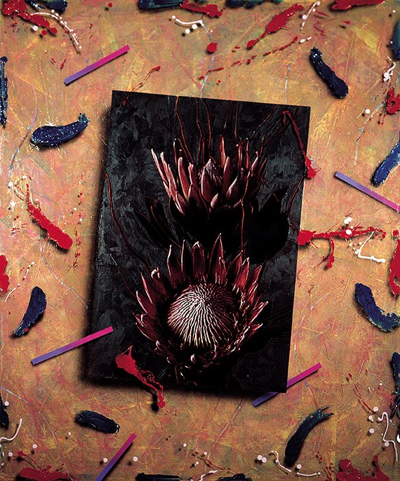
“Protea” Mixed Media on Canvas 60”x66”
Chapter 18
This brings me to the present, 44 years since I started this journey. After approximately the same number of years teaching as I had worked professionally as a graphic designer, I finally came to the conclusion that I no longer needed to include imagery in my paintings and prints. I had been working with floral images for about 14 years and realized that my abstract paintings from 30 years ago held the same properties of color, light and space as my newest paintings and the images were getting in the way. I was always trying to conform or have my work accepted and I think in a subconscious and even an occasional conscious way, I thought working with images in a more realistic fashion would achieve this. I now think I was wrong and who cares anyway! I am no longer fearful of conformation or being compared to other artists, styles or movements. I am no longer afraid of being cutting edge, traditional or any other label. I am just me and these are my paintings!

“X Marks The Spot” Acrylic on Canvas 66”x66”

“Blue Hearts” Acrylic on Canvas 36”x48”