Route 44 – A Journey, Chapters 14, 15 & 16
Chapter 14
A few years before, my parents had sold their business and moved to Oklahoma City to be closer to my brothers and their families. Moving to Oklahoma City was also the logical move for us at this time. So, we packed up another U-Haul and headed up I-44. We found a nice little rent house on the north side of Oklahoma City, fairly close to my mother and my two older brothers. Jo had great clerical skills and never had trouble finding a good job and Oklahoma City was no exception. I on the other hand was a different story. My oldest brother knew the owners of one of Oklahoma City’s oldest and most respected art and frame shops, Denton Frame. I called them and they interviewed me and offered me a job the first week we were there. I came to work that first day thinking I knew everything there was to know about framing artwork. I had two degrees in art, I had framed most of my work for the past 12 years and I had even managed a small art supply and frame shop in Lawton the last month we were there. What more could I learn? Well, the very first day I made more frames than the entire month that I managed the shop in Lawton. The first month I made more frames than I had made in my life and the frames were more complex. In Lawton, I prided myself in mat selections almost always using a double mat with a nice contrasting color accent then surrounding the work with a thin simple frame. At Denton’s, Mrs. Denton would choose three and four color mat combinations with frames that would consist of four different moldings put together. It was hard work and I learned a lot about the framing business and the successful system that Mr. and Mrs. Denton had put together over 40 years in the business.
The house that we were renting had a spare bedroom that I converted into a studio. I continued to work on my collagraph series, finishing up two large paintings that I had started at Cameron and several smaller collagraph prints that I printed on the press at Cameron before we left. Quickly, I ran out of printed collagraphs and to continue this series I would have to find a press to print more images. I considered purchasing a press but that was a lot of money, so I started experimenting with the collagraph plate making techniques and adding color as I built them as apposed to coloring them after they were printed. The last painting of this series was completed on canvas using these techniques. I have included this painting in my retrospective show because of its significant contribution to the evolution of my artwork.
Chapter 15
After almost a year at the frame shop I really wanted to use my art talent more, so I started looking for graphic design related freelance work. I answered an ad that I saw in the newspaper, seeking illustrators. It turned out that the company was a recording studio that was looking for design and illustration help for album covers. This seemed like a very glamorous job and at the interview I learned that the company was divided in two parts. One part of the company worked with Christian music and the other worked with secular knock off music. The majority of the work they were looking for at that time was the knock off music. Let me explain, during that time period, the late ‘70s and early ‘80s, there were very few copyright laws on performed and recorded music. In the early ‘70s there were a lot of companies that sprung up called “bootleg or pirate” companies. They would buy the latest recordings and duplicate them and sell them in eight-track format at a cheap price in truck stops all over America. They didn’t pay royalties and the original artists and recording companies got nothing for these sales. As you might suspect, legislation was quickly passed making this illegal. Many of those same companies started making “sound alike” recordings to keep their product legal. A “sound alike” was a recording of the same music by a different artist that tried to sound as much like the original as possible. For a short period of time this was legal and that is where I came into this picture. The company that I interviewed with was one of those companies. They gave me one assignment to see how I would do. They would pay $75.00 for an illustration of Dolly Parton to be used as cover art for an eight-track tape. The product name was “The Hits of Dolly Parton” and in real tiny type “as performed by The Nashville Sound.” My illustration career was born! They loved the Dolly Parton illustration and quickly gave me more assignments. I started doing one to two of these a week in addition to my full-time framing job. I liked the challenge and we could certainly use the extra money. After a few weeks the recording company asked me if I would be interested in a full-time position with them. I knew from the beginning that this company was a little shaky but I really liked the idea of making a living with my art skills. I talked with them more about the opportunity and they told me not only would I be working full-time but also I would be the creative director of the newly created art department. As the director, I would be in charge of the entire creative team and could hire additional artists to expand the production. That’s all I needed, a title and I was in. When I started working they didn’t even have a place for me or the newly created “art department” to work in, so they asked me to go to their warehouse/manufacturing plant. They literally put a drawing table in the middle of an open area in the warehouse and said “Here’s your desk, we’ll put walls around it soon.” So, I started working. There was one other illustrator, a production artist and a secretary when I started. Everyday was a new experience, the first day we kind of huddled in the middle of this giant open space. The next day when we got to work we had one wall propped up and another being built. The next day we had four walls and a door. It really got interesting when they started putting the roof over us while we were working! I eventually hired another illustrator and another production artist/typesetter and we gradually built a pretty efficient team. The company had a large catalog of products that they were selling (or trying to sell) with type only labels, usually printed on day glow paper. Our job was to make these products look like real tapes from major recording labels. This was no small task and they wanted it done yesterday, so we worked. We had 3 illustrators and our goal was to finish one product each day. That meant one full color illustration per day or five illustrations per week for each illustrator for a total of 15 per week. One of the things I noticed very quickly was that the covers started all looking alike. This was no real surprise under the time restraints we were under. I also noticed that even though the illustrations looked really good they did not look like real products from major labels. Most of the major labels used photography, so we started using some photography to vary the look and style. This not only helped with variety but also it was less labor intensive so it helped us achieve our quotas. At first I hired a professional photographer and used his studio for a couple of projects. I had always used photography to shoot slides of my paintings and while I was in school I learned how to process film and use an enlarger to make prints. Working with a professional photographer and watching him in the studio gave me the confidence to try it myself. I realized that all I needed was a little more professional equipment, so I talked with the owner of our company and he agreed to purchase a lighting system and a 4×5 camera and just like that my professional photography career was born. We continued on at our frantic pace, and I began to do more and more photography work while the others did illustrations. This continued for about a year and suddenly we caught up with the company backlog of products. My supervisor talked with me and told me that I would have to trim my staff. We had grown to about 8 — 3 illustrators, 2 production artists, and 2-3 support staff. This meant I would have to fire someone. This was the hardest thing I had ever done. I started with the last production artist I had hired. This bought me a couple of weeks before I had to let someone else go. After the first, the second and third came pretty quickly and it never got any easier. The questionable ethics of the company and their instability really pushed me toward leaving and starting my own design studio. I talked to the owner of the company and he seemed relieved at the prospect of me leaving and going back to a freelance basis so I started looking for a small office space that I could set up shop. Originally I asked one of the remaining illustrators to join me and a writer/public relations friend that we had worked with for a short period of time in my new graphic design/ad agency. They both came with me but it was a struggle financially and my illustrator friend left after about a month. The PR person left after about a year and it was down to me. In addition to the pressure of starting a new business, Jo and I had our second child, a beautiful baby girl we named Devin. I struggled on for the next 15 years. During these years I continued to paint and tried to stay up with current trends in the fine art world. In the late seventies and early eighties I became aware of a minor art movement called Abstract Illusionism and in particular with an artist by the name of James Havard. I was definitely influenced by his work and started using some of his cast shadow techniques on commercial illustration projects. Later, I used these same airbrush techniques on larger scaled paintings. In the course of writing this book and researching my facts I came across the Wikipedia definition of Abstract Illusionism.
Abstract Illusionism, a name coined by art historian and critic Barbara Rose, is an artistic movement that came into prominence in the United States during the mid-1970s. Works consisted of both hardedge and expressionistic abstract painting styles that employed the use of perspective, artificial light sources, and simulated cast shadows to achieve the illusion of three-dimensional space on a two-dimensional surface. Abstract Illusionism differed from traditional Trompe-l’oeil (fool the eye) art in that the pictorial space seemed to project in front of, or away from, the canvas surface, as opposed to receding into the picture plane as in traditional painting. Primarily, though, these were abstract paintings, as opposed to the realism of Trompe l’oeil. By the early 1980s, many of the visual devices that originated in Abstract Illusionism were appropriated into the commercial world and served a wide variety of applications in graphic design, fabric design and the unlikely decoration of recreational vehicles. This proliferation of Abstract Illusionist imagery eventually led to the disintegration of the original artistic movement and its transition into the mainstream.
I found this definition quite ironic since I first used the technique in illustration and then converted it to fine art, just the reverse of the definition. I have used this Trompe-l’oeil technique in various ways for over 30 years. I guess I am no longer (and probably never was) in the forefront of innovative trend setting art. Oh well, it still interests me so I’ll keep doing it until it doesn’t feel relevant to my work.
Commercial illustration projects greatly influenced my future paintings and where I discovered “Abstract Illusionism.”
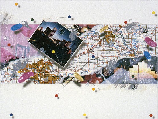
“Book Cover Comp” / 12”x9” / printed map, photography and acrylic on watercolor paper
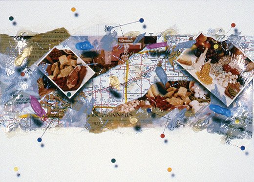
“Book Cover Finished Illustration” / 12”x9” / printed map, photography and acrylic on watercolor paper

“The Gift of Life – Magazine Cover Finished Illustration” / 8.5”x11” / photography, Xerox copies and acrylic on watercolor paper
Chapter 16
The next major series of work was motivated by these early illustrations. The first was a book cover illustration for a book that pointed out restaurant locations in the state of Oklahoma. I used a road map and colored dots with abstract acrylic paint splashes all glued in a collage technique to rough watercolor paper. All the elements had airbrushed shadows that made them appear to float above the watercolor paper ground. The second was another cover illustration for a local health magazine. The featured article was on the topic of organ donation and the gift of life. Again, traditional illustration and photography were collaged onto a rough watercolor textured paper with airbrushed shadows. The primary inspirations came from the Abstract Illusionism movement and an illustrator by the name of David Lesh. Lesh uses a collage technique with Xerox copied elements, typography and paint on rough textured surfaces. These two commercial illustrations were very successful for me and inspired me to take the concepts to a larger scale. About this same time my early mentor back at OU, Gene Bavinger, developed a technique of painting in reverse on glass. This technique produced some of the most visually exciting paintings I have ever seen and became his trademark style that he explored until his death in 1997. Bavinger used very thick transparent acrylic paint and applied it to large plate glass sheets with a variety of tools including brushes, palette knives, squeegees and occasionally spray guns. As I mentioned the paint was very transparent so he layered the thick paint on to build up a rich and deep color saturation. Occasionally he would lift the glass up to see his progress from the bottom because it would eventually become the top. When he was satisfied with the layering, he would apply one last thick coat of straight polymer acrylic followed by raw canvas. The acrylic would bond the canvas to the rest of the paint and after it dried, he would peel it off the glass. The canvas would then be stretched in a normal manner on a stretcher frame. As I mentioned, the result was spectacular. The paintings were deep, rich and textural while the surface was shiny and totally smooth. This new technique inspired me to combine the glass technique of Bavinger with the collage and imagery techniques that I was using in my illustration work. The first couple were fairly small, approximately 24”x36” and allowed me to experiment not only with the technique but also the imagery. They gave me the opportunity to use my photography skills and combine images that I had created earlier in my career. The first images were black and white personal images that I hand colored. This later led to commercial images that helped tie my two worlds of Graphic Design and Fine Art together. The bulk of this new series had a central image theme, flowers. The inspiration for these images had a direct tie to my design/photography business. One of my largest clients during the late eighties was a floral wire service company by the name of Carik Floral Services. They were based in Denver, Colorado, and I knew the owner when he worked in Oklahoma City for American Floral Service. He was head of sales and I worked with him on several promotional and advertising projects. When he started Carik, I developed the logo and corporate identity for his new business venture. After the company was established, I started working for him on several photographic catalogs. He would fly me to Denver and I would rent photo equipment and set up a temporary photo studio in his warehouse. We would work for about two weeks, then I would fly home for about a week, then fly back and start all over. We did this for almost the entire summer to complete their first sales catalog. My job was to shoot 4×5 transparencies of each floral arrangement as the floral designers finished them. There were three floral designers working in the design studio with almost unlimited fresh flowers to pick and use in their arrangements. Even with three designers working, I still had quite a bit of down time, so I filled that time by shooting “flower portraits.” These “flower portraits” eventually became the imagery that I used in my floral painting series.
In 1990, I got two separate calls from different friends, to tell me that they had seen ads in different newspapers advertising an opening at Central State University for a teaching position in the Art Department. Amazingly, I had also seen an ad in the local newspaper for the same position. I thanked both friends and told them I would check it out, but frankly, I didn’t have much hope. My previous experiences had taught me that often positions advertised in this manner were already filled and the ads were merely a method of satisfying state government regulations on hiring. I did look into it and was told the position was still open and was given information on how to apply. I immediately started the application process and submitted my credentials, letters of recommendation, and slides of my work. The position was for a person to teach graphic design and computer graphics. My degrees were in Fine Art, but I had been practicing Graphic Design as a professional designer for the last 15 years, so I felt comfortable in my abilities to teach in this field. My computer skills were not very good because this was a very new skill at that time. Most of the graphic design production at that time was still being done manually. Even with my extensive professional experience, I was still not very optimistic about this position. As I mentioned, it had been 15 years since my last teaching position at Cameron. Outside of the first summer after Cameron, when I was actively looking for a new teaching position, I had not heard about a possible teaching position let alone applied for one and all of the sudden three separate leads, all for the same position. The Lord truly does work in mysterious ways! The hiring process at the University level is a very slow and methodical process. I was not surprised that I had not heard anything from Central State, in fact I kind of forgot about it when I got a call from a professor in the Art Department. He introduced himself over the phone and said that his call had nothing to do with the teaching position, but rather he was looking for information on how computer technology was being used in the graphic design profession. He asked if he could come to my office and talk with me further about this topic. I said, “Sure” and we agreed on a date and time later that week. The professor’s name was Bill Wallo and at that time he was the gallery director at Central State. The Macintosh computer was fairly new at that time and the desktop publishing software, PageMaker, was making a lot of news in the graphic design industry. I did not own either but I had read several articles about them and had talked with many designers and production artists at various service bureaus in Oklahoma City. When Bill came to my studio, he brought a friend, Dave Hessie. They were very interested in my opinion on the topic of desktop publishing and what they called multi-media. To this day I am not sure what that word multi-media means in the context of computer graphics, but we spent a good hour talking about the topic. I shared with them what I knew which was not much. At that time service bureaus were primarily typesetters and color separation houses and they did not feel the new “desktop publishing” quality was good enough to affect the current methods of graphic design production. The one thing that I took note of was the amount of industry buzz there was about this new topic. You could not pick up any graphic design periodical without seeing at least one main article devoted to the new computer and software. In the 15 years of my professional design career, I had never seen anything that commanded that much attention. In less than two more years many of those typesetters were closed or had converted to digital output service bureaus. It took about two more years for the color separators to go out of business and the rest is history. Through our discussion I learned that both Bill and Dave were painters and became friends in school, so I steered our conversation toward fine art and showed them a couple of my new pieces which both used photography and a collage technique. Bill seemed very interested and said he was curating a new show that he felt my work was perfectly suited for. I said I would love to participate and he verbally asked me to get a couple of pieces ready. I said I would and thanked him for the opportunity. I submitted a couple of pieces to the group show that included about 10 artists from the local area that used photography in some form in their artwork. I went to the opening and this was my first visit to the campus. I later found out that Bill was on the search committee for the position that I had applied for and I definitely think our meeting had something to do with me being hired.
I finally got a call from the chair of the search committee, Dr. Jim Watson. He asked if I could come to the campus for an interview and I quickly agreed to do so. The committee included Dr. Watson, Bill Wallo and Dr. Joann Adams. The interview went well and they introduced me to several other faculty members and asked me a few questions about my teaching philosophy and how I would handle a few specific teaching situations. They asked me to come prepared to show my work and talk briefly about it to a small group of faculty and students, which I did. After my lecture they showed me around the art building and explained specifics about their program and students. At that point Dr. Watson walked me across campus and pointed out a few buildings on our way to the Administration building. In the Administration building I met with a person who explained the benefits and salary package, but no one actually offered me the job. I left feeling pretty good about the interview but a little confused. Later that week Bill Wallo called and offered me the job and said they would prepare a contract that would make it official. I was elated and it couldn’t have come at a more opportune time. I immediately started planning and finishing all the current work in the studio so I could close the studio. Thinking back on that time period, I now realize that everything went together amazingly well in a very short period of time. By the time the fall semester started, all of my business responsibilities were pretty much settled and I was able to concentrate on my new job.
May 22, 2016 lhefner Art, Book, Illustration